Creating a trifold brochure is an excellent way for businesses to convey their key messages in a compact, easy-to-handle format. However, the limited space of a trifold brochure demands careful planning and organization. This guide will provide you with strategies to effectively utilize every inch of your trifold brochure and explain how inkr Printing can assist you with your trifold brochure printing needs.
Anatomy and Functionality of a Trifold Brochure
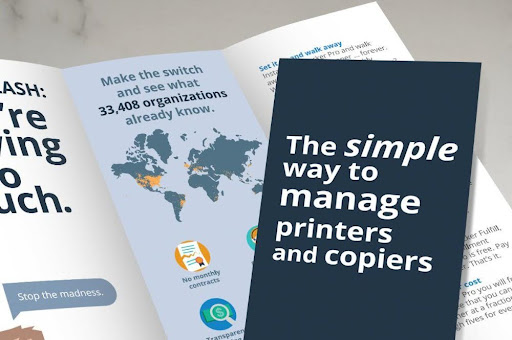
A trifold brochure is a marketing tool folded into three panels, typically on a single sheet of letter-sized paper. It’s designed to open up sequentially, revealing information in a controlled manner. The anatomy of a trifold includes:
- Front Panel: This is the cover and needs to capture attention, often featuring the business logo, a compelling headline, or striking graphics.
- Inside Panels: These contain detailed information about the product, service, or event. The layout is critical, as it guides the reader through the content in a logical sequence.
- Back Panel: Often used for contact information, a call to action, or a map.
The purpose of a trifold brochure is to inform, engage, and persuade potential customers by presenting key information in a compact and visually appealing format.
Trifold Layout and Space Allocation
When designing a trifold brochure, effective use of space is crucial to ensure that the content is both appealing and informative. This section outlines strategies for optimizing the layout and allocation of space within a trifold brochure. By strategically organizing content, using impactful visuals, and maintaining a balance between text and white space, you can create a brochure that not only attracts attention but also communicates your message clearly and efficiently. Let’s dive into how to best utilize each panel of the trifold to maximize your brochure’s impact.
1. Capture Attention on the Cover
The front panel is crucial for making a strong first impression. Use dynamic headlines, compelling graphics, or thought-provoking questions to draw in the reader. This panel should intrigue and motivate the audience to explore the brochure further.
2. Organize Information Hierarchically
Structure the information inside your brochure in a logical hierarchy. Start with the most vital information in the center panel, as it’s typically the first section viewed upon opening. Supplement this with detailed supporting content on the side panels to enrich the central message.
3. Use High-Impact Visuals Sparingly
Optimize the use of space by incorporating powerful but compact visuals. High-quality images, infographics, and charts can communicate key information more effectively than text alone. Inkr Printing can produce sharp, eye-catching visuals that capture attention without overwhelming the space.
4. Employ Clear, Concise Language
Given the limited space, clarity and brevity are paramount. Use straightforward language and organize content with bullet points, headers, and subheaders to enhance readability and ensure that key messages are easily digestible.
5. Balance Text and White Space
Avoid the temptation to fill every inch with text or images. Adequate white space can make your brochure feel less cramped and more professional. It helps to highlight the most important pieces of content and improves readability.
6. Integrate a Strong Call to Action
The final panel should carry a strong, clear call to action (CTA). Whether it’s encouraging a phone call, directing to a website, or offering a discount, the CTA should compel the reader to take a specific action, clearly stating what steps they should take next.
7. Consistency in Design and Branding
Ensure that the design elements like color scheme, fonts, and style are consistent throughout the brochure. This consistency helps reinforce your brand’s identity and makes the brochure—and by extension, your business—more recognizable and memorable.
8. Strategic Use of Folds
The physical folds of the brochure can be used to guide the reader’s journey through the content. Design each panel to gradually build upon the last, ideally leading up to a decisive conclusion at the final fold, which should then spur the reader into action. This strategic unfolding of information can engage the reader more deeply, enhancing the impact of the brochure’s message.
Expert Trifold Brochure Support from inkr Printing
When it’s time to bring your trifold brochure to life, inkr Printing is here to help. With state-of-the-art trifold brochure printing technology, we ensure that every fold is crisp, every color is vivid, and every word is sharp. Our experts can guide you through choosing the right paper, finish, and design elements to make your brochure stand out.
Partnering for Success
By following these strategies and partnering with inkr Printing, you can maximize the effectiveness of your trifold brochures. Whether you’re looking to promote a new product, announce an event, or increase brand awareness, a well-designed trifold brochure can play a pivotal role in your marketing strategy. Together, we can create a powerful marketing tool that not only informs but also impresses and engages your audience.
Contact us today for more information!
